Wednesday, February 23, 2011

The Guys Cocoa Packet Cards a Couple of Baptism Cards

     Well, I had a productive day today. I went to lunch with a friend of mine to celebrate my birthday belatedly (my birthday is in December, but we had family medical things going on and it wasn't a good time). After she left, I started some laundry and headed up to the craft room. I worked on the male counter-part of the cocoa pocket card that a posted a few days ago. For this version I used a patterned paper from the DCWV Holiday Collection Christmas Stack. I used the same Inkadinkado Christmas Characters Stamp and colored it to match the paper, with Steadtler Watercolor pencils, Gelly Roll Clear Star for the snowflakes and trails behind the sled and a black glaze pen for the eyes and nose. I also used the same Copics BG10 on the bears and B00 to accent the snow and ground the image. The white rectangle was cut with a nestability. The sentiment was stamped with ink from Color Box's Petal Point Pinwheel collection. I also used the blue from the same collection to ink the sides of the white rectangle.


     Here are the two designs together.

If you'd like the directions for the cocoa pocket card, you can find it on the second post below this one.

     While ink was drying on this I worked on cards that I still needed to make for a gift for the Youth Director at my Church. If you've been following the saga since the beginning, I was making her some cards as a belated Christmas present (part of the December thing). The cards I've already given her are posted earlier on this blog. I asked her what else she could use, thinking I'd make her about 2 more cards and she said baptism, so today that's what I made. I think I might try to make her a couple of birthday cards, also, sometime soon. 
     The 2 cards I made are basically the same except for paper color and ribbon.  For the first one I choose green paper from Paper Studio's Pastel Cardstock Pack, cut a 5 1/4 x 4 inches and embossed it with Sizzix Divine Swirls. Next I added striped vellum cut at 4 3/4 x 3 /12 inches and added silver metallic dots to the corners. The green ribbon was some I picked up at Joanne's. I cut a scalloped oval with a nestie and stamped the wood mounted Stampabilities Ornate Cross on it with Big and Bossy, then embossed it with silver metallic embossing powder. I then added the oval popping it up. The oval was cut with a nestie also and stamped with Clear Stamps Wedding Congratulations in Dark Chocolate by PaperTrey Ink. It was double popped to go over the image. The inside is very basic for me. I just left if for her to write in. The butterflies were cut from some of the scraps with a Martha Stewart punch


     You see the yellow is basically the same, only embossed with Swiss dots and stamped with Summer Sunrise ink from PaperTrey. The ribbon is Best Occasions Self-adhesive Ribbon

     What would I have done different. The yellow one was actually done first and I realized that the vellum needed to be cut smaller, so I fixed that on the green one. On the green one, I had forgotten to add the ribbon and had to sneak it under after it was glued down, but it worked, phew!  I think the ribbon on the yellow is place to high. I like the placement on the green better. Well, we won't talk about how far the laundry got, but there is always tomorrow.
     Thanks for stopping by today and visiting with me. Leave me a note if you've got a moment more.  I may not be able to post on late Friday/Early Sat. because I will be picking my son up from college for his spring break. It doesn't seem like spring, but that's what the school calendar says. Maybe that's why so many of them go south, to find spring ;- ) Until next time then.

Tuesday, February 22, 2011

Rainy and cold, Yuk!

     Hi everyone. I hear from some of your blogs that spring is coming, but it just teased us here. Today, was rainy, icy and cold. To add to that tonight it is going to snow :- (  The grey skies were an energy killer for me. I did get over to my local Archiver and pick up some Flowersoft, with a coupon and did one of three "Make it and Take it's" they had going today. I was interested in making the flower with the McGill punch. I keep watching the tutorials on the 3D flowers, and I have added some of the touches to my regular die cut flower, but I haven't made any that were suppose to be 3D or used the "specialized" tools. I usually find something on my desk that has a rounded end and use that to shape the pocket or cup the flowers. It was very interesting, easy of course, but the woman doing the demo, wasn't very personable, which is not usual for my Archiver. I had a much more interesting and friendly conversation with the woman checking me out and the woman standing next to her for 2 min, then with the woman who gave me a personal lesson for about 10 min. Anyway, here is how it turned out.


     Now if I had designed the tag, I would have changed the color in the center and probably had darker leaves. I also would have creased the leaves to add more interest. The sentiment is embossed and there are stickels on  the stamens. I will probably get the tools the next time I get a coupon or maybe put it on my Easter list.
     The other thing I did today wasn't crafty, but it was for my cards. I am trying to get my computer files organized. I have some wonderful digital files of paper, stamps and SVGs. The problem is they aren't organized very well (I download my SVG's on my main computer which is a MAC, but then they have to be moved to my crafting and Sure Cuts A Lot computer which is a PC). The files don't get to the PC very often and I don't track well, what's been moved. Also, I need a printed file of what I have so I can just flip through a book, because that works better for me, so I need to create proof sheets of all of it. This will take many days, but I try to work on it sometimes. Don't ask about photos >. > Thanks for spending your time here with me. Oh, if anyone knows of a Norwegian Elkhound breeder in the midwest, please let me know. Thanks!

Saturday, February 19, 2011

Cocoa Pocket Card

     I have nine college students, who live away from home, that I try to send a little love. I planned for the next card to be a pocket card that would hold a packet of cocoa. (Who knew it would warm up in the midwest.) I looked around the internet, but most of  the ones I found were more box size, or just over size. I really wanted to stay with an A2 card, if I could, so I designed one my self. While choosing my papers, I realized I had 2 designs. One for the males and one for the females. Today, I show you the one I made for the females, since that's the only I've done ;- ) I have three to make for them.

     To start I  cut the paper 5 1/2 inches by 11 inches. Then I scored it at the 2 1/2 inch point and the 6 3/4 inch point. I then rounded the corners. The second photo shows how it will look when it is folded up.


     I then choose a pink paper from Paper Studios Pastel Cardstock Pack for the bottom mat and cut it to 5 1/4 x 4 inches. The next mat is a pattern cardstock with glitter and texture, that came from a JoAnn exclusive, they had the Christmas before last called Peppermint Forest. It was cut at 5 x 3 3/4 inches. I used my nestabilities to cut the large scalloped oval and stamped it, with the sledding polar bears from Inkadinkado's Clear Stamps Christmas Characters and also, the sentiment from the same set. The image was stamped with Papertrey's Enchanted Evening Ink and the sentiment with Colorbox's Enchantment Aqua Ink. I colored the snowflakes and the swirls in the image with Gelly Roll Clear Star. The clothing on the bears and sled were colored with Steadtler  Watercolor Pencils and also some highlights on the scarf with the Gelly Roll and the hat with a White Glaze Pen. The black on the bears (nose and eyes) is a Glaze Pen and a used Copic Markers BG10 to shade the bears and B00 to give some definition to the snow and add a base to the image. I also inked it with Broken China Distress Ink.


     On the in inside, I cut a different piece of glitter, embossed cardstock from Peppermint Forest for the front of the cocoa pocket. I planned the cuts to get the images from the paper. I cut a 1 x 2 1/2  inch rectangle of the pink paper, and rounded the corners. I then used my ATG gun to tape the sides of the pocket up. I used Versamark Dazzle and a small snowflake from the Inkadoo stamp set and randomly stamped the paper, then I stamped it with a sentiment from Hero Arts Big Hugs in Tsunkinako Black Ink. Each one of these cards is a bit different inside, due to the different characters on the paper. I didn't pop up the image on the front, due to the fact that the cocoa, already makes it tight in the envelope, however, on the inside I popped up the sentiment, since it's at the bottom and below the the bulge made from the cocoa. Unfortunately, I was out of 1/16 inch pop dots, but I'm thrifty, so I cut up the surrounding paper and used that. Shown below.


     The sentiment label was inked, except for one. That was the first one I put on when I was scrambling around to find my pop dots and so I forgot to ink that one. I get distracted by one thing and forget what I meant to do, hate that.  I decided I should make tags to go in the pockets with a personal note for each one. I stamped a tag with Big and Bossy using a grouping of snowflakes stamp and filling in with the small snowflake stamp and embossed it with White Embossing Powder. My plan was to spritz it using a mini-mister filled with Turquoise Perfect Pearls, water and Broken China Re-Inker. I found that one of my mini-misters is not a mister but a mini-jet sprayer! Well, that was interesting. I dealt with that and the first tag, which is too dark, but I'll live with it . I filled a new mister and did the other 2 tags and also added Worn Lipstick Distress Ink to the tags and wiped off the excess from the embossed areas.
I added Martha Stewart twine and will write a note on the back of this one and creatively on the front of the others.


     So, there you go, 3 card down and 6 more to go. They will probably be basically the same, but with different papers, but who knows. We will see where creativity leads that day. What would I do differently? Well, I am thinking of looking for snowflake buttons for the front yet or buttons in coordinating colors. With a total of 9 cards I didn't want to get too detailed or difficult.  I think I might have papered the inside of the pockets. I also might have embossed 1 or both of the sentiments, again trying to keep it fast. Thanks for coming back and looking. Drop me a word about how you see things. 

Wednesday, February 16, 2011

A Fish Tale of a Card

     Well, I did finish the card I wanted to and I feel so ahead of schedule for a change. This is actually a March card. Woo Whoo! That won'd last long. I have 11 college students for whom I need to make cards. Anyway today's card is for a friend's husband who likes to fish. So on the front, I used a brown pattern paper from Paper Pizzaz and a blue watery print also from Paper Pizzaz. I crossed that with a piece of brown twine from Martha Stewart and added fish cut from Cricut's Paper Doll Dress Up cartridge (I think is image 43, which is the fisherman, with the accessory 3 Feature Key pressed for one and the accessory 3 Feature with the shift for the other).  I cut the at different sizes from about 1 1/2 inches to 3 1/2 inches out of  2 different patterned brown papers and 1 plain brown paper. I then inked these with Distress Tea Dye Ink to bring out the definition of the cuts and added some markings with glaze pens. I cut my digital sentiment, LDJ Noodge font from  Lettering Delights, and cut with my oval nestability. I then cut a brown mat with the next size nestability and the brown patten paper.


     Inside, I used the Life's A Beach cartridge and cut a 3 1/2 inch mermaid from page 11. The base was cut in flesh and I hid the contours of her face with the Gypsy. I also used the Gypsy to cut the layers. This allows you to cut her hair separately from her bikini top and her tail. I eliminated her flower, because I was going to use a flower from the Archiver mix as well as hiding the contours on her tail that made up her scales. I cut her hair from a brown scrap I had and used the pink glitter paper, that I used for the Valentine card on a past post, to make her bikini top. To cut her tail, I used Spellbinders Premium Foil. This is actual metal and was difficult to cut. I know my blade is close to needing to be replaced. I used glue dots to attach her tail.  I added a flower brad from Spare Parts to the flower in her hair. After the mermaid was assembled, I used a glaze pen to draw on her scales and a .05 mil pen to draw on her face. I used my Copic E25 to add depth to her hair. I used the same paper from the front, for the bottom mat and some sand-like patterned paper for the top mat. I made the digital sentiment with LDJ Jilligraphy from Lettering Delight Fonts. I added a wave border, cut from Life's A Beach (set at 3 inches wide on the Gypsy), to the bottom of the sentiment.


     I think she turned out very pretty. What would I change? Well, don't you just hate it, when you put the paper down and notice that it's crooked, just as it sticks and all the rest of the card is together? OK, I'd change that. I might have, or maybe still will add some glitter to the wave tops. Then again, this is a guy card. I don't like the squareness of the top, right, inside, sentiment corner. Tell me what you think.
Thanks for stopping by and spending some of your time here.

Sunday, February 13, 2011

Easel card, multi-views

     We didn't get back from visiting my son at college until very late, so I didn't get these posted until now. Here are the different views of the easel card to help you understand it's construction better.


     The directions for cutting and assembling this card are in the previous post. Thanks for stopping by and for your comments.

Saturday, February 12, 2011

Valentine for a friend

     Today's card is my first easel card. I cut the base card stock at 11 x 4 1/4 inches. I then scored and folded it in half making it an A2 (5 1/2 x 4 1/4 inches). I then scored the front in half (2 3/4 inches) and folded the opposite way (up and out from the card).  I attached a piece of patterned paper from Paper Studio, to a piece of 5 1/5  x 4 1/4 white card stock, to make it stiff enough. This I then attached to the piece of the base that was folded out, attaching the folded piece to the top of the patterned piece. You might want to try the card closed and easeled before gluing, to be sure you understand the orientation of these pieces. That was the way it worked for me, because just looking at pictures wasn't enough.  I'll try to post a side view of the card tomorrow, so you can get a better view of that.

Here is the card easeled. (by the way I don't think that's a word ;- )

     The top heart was cut on the Expression using the Storybook cart at 2 inches, from pink glitter paper (use multi cut and raise your blade setting for this). The one underneath was suppose to be a shadow, but I used the dot feature key by mistake and it works. The second heart is from the Accent Essentials cart. The main image is cut from the red card stock and the main image with the shift key is cut from the pink glitter paper, also at 2 inches.
This is what the card looks like closed, except when it lies by itself it pops up a bit, so the ends don't seem to line up at the bottom, but they really do.

     On the inside, I used patterned paper from Paper Pizzaz, cut at 3 inches, at the top. I attached a piece of red card stock at the bottom, that I punched with a Martha Stewart punch and then I added pearls. I used pink ink to stamp  a sentiment to a piece of white card stock and then embossed it with clear embossing powder. The stamp was a $1 stamp from JoAnn's. I then added epoxy stickers from EK Success.  I printed my personal sentiment digitally and cut it with a scalloped oval nestability.


     What would I do different? Well, I'd meant to dry emboss the red paper on the inside and I think I'd still like to see that. Also I think I would have cut the inside red piece bigger, so that I could center the way the punches ended up better and the trim it to fit, instead of cutting first and then punching. I am really happy with the paper though. I'might have done the Happy Valentine's digitally, but I was trying to use 1 of only 2 stamps I have and the other didn't fit. Well, there you have it. I hope my friend likes it. thanks for spending your busy time with me. Let me know that you stopped by.

Thursday, February 10, 2011

Getting on with the Valentines

     Well, despite some shopping at Hobby Lobby and JoAnne's, I was still able to finish my DS's Valentine card. Very tricky this year, because he's in collage and likes to put up his cards on his bulletin board, so I had to keep it non-mushy and non-embaressing, as well as mature ;- ) That's an awful lot to ask of a mom! So I decided, no pink or red on the outside. I have picked up a lot of cool, free Photoshop brushes, at a few sites so I took some time yesterday, just going over them. One, I liked for my son, was from a site called photoshopfreebrushes.com. Who'd of guessed. I applied a few effect to it such as, chrome and wow chrome beveled edge to make it look metallic. I had the original layer on top and made that layer partly transparent for the effects to show. I also add one of the texture backgrounds that comes with Photoshop Elements. I then printed this and used it as the top layer of the card. On this I attached the word Hugs cut from the Smiley Cards cart on the Gypsy. It was cut at 1 1/4 inches from blue DCWV paper. I bowed it slightly and attached it with shiny heart brads and silver dull brads from Spare Parts. I also added faux stitching with a black glaze pen.


     On the inside, I started with a black mat. I made the sentiment digitally using the font Tabitha, which comes on Macintosh computers. After that, I remembered an idea I had while shopping, to put a list of the reasons we love him, in his card. So, I decided to make a tag and find a way to squeeze that in too. I stamped the tag with a clear stamp by Autumn Leaves called Hand Drawn Journaling Panels by Katie Pertiet with Big and Bossy and clear embossing powder. I then rubbed rubbed Ranger's Broken China ink over it and cleaned the excess off of the embossed areas. I wrote on it with a black glaze pen. I made 2 hearts out of Core'dinations Magic Paper that was black with a red core. I cut the hearts at 1 inch with the Expression using Plantin Schoolbook using the Roly Poly feature key. I then dry embossed it with Swiss Dots and sanded it so the red core would show. I used one of the hearts to help hold the tag on the card, but also attached the tag with removable tape, so he can take the tag off and save it anywhere he wants.

     What would I change? I would have planned for the tag better to begin with and moved the writing  over inside the card. Or... maybe I would have planned a pocket in the card for the tag to fit in and the it could be slipped out. Though I do like it as an element in the card, maybe I'll shorten the twine a bit yet and attach the twine across the top. The inside isn't quite right, but I like the card. I might have been able to make the digital writing narrower and that would have balanced the tag better. Ah, that sounds better.
Well, thanks again for visiting. Please give me your feedback. I'd love to hear from you.

Tuesday, February 8, 2011

Fishing Card

     Well, the centerpieces are done, finis!  I wanted to post a picture of the teens with finished product, but I forgot to get permissions, so here is a fun photo of some of the vases.


     So, moving on, today I made a card for a friend's father, in his 90's. He is in a Nursing Home and enjoys getting cards and since he use to like to fish, I decided to make a nostalgic fishing card. It's an A2 card (5 1/2 x 4 1/4 inches), which I matted with a 5 1/4 x 4 inches piece of maroon card stock, that I embossed with the Sizzix Texturz Texture (I know it sounds redundant to me too) Plates Kit #2, design Diamonds after rounding the corners on the bottoms of both pieces. I then used the Expression with Accent Essentials cart to cut the Label shape at 3 3/4 inches. It's titled Shape #48 in the handbook and you use the shift key to get the filled in shape. The paper is Gartner Studios, BonVoyage - World Map, available from Hobby Lobby.  I made sure I featured the midwest, because that was where he lived. I did this by test cutting with typing paper and then just removing the cut image, without removing the mat, I had the blade return to the next line, and putting the piece I wanted to cut in place of the cut image with the area I wanted to be sure to showcase, showing through the hole. You should remove the typing paper at this point. I then moved the blade horizontally to the right and had it repeat last. The fishing boy is from  the Cricut cart, A Child's Year and is cut at 3 1/4 inches form Recollections Neutral card stock collection with a black shadow. I added the buttons, tied with doubled thread, since I couldn't find my black floss and the twine color I have doesn't go with the card.


     On the inside I matted it with black cut at 5 1/4 x 4 inches and patterned card stock from Recollections called Time Frame Second Hand Argyle Dark, cut at 5 x 3 3/4inches. I did the sentiment digitally using Lettering Delights's Shelly Script. The font is sized at a large 36 to help him read it. That piece is cut at 4 3/4 X 3 1/2. I stamped the 2 candles with a stamp from Hero Arts's set Cupcakes. The flames are colored with a yellow glitter Starlightz pen and a pinkish-red Gelly Roll pen at the center of the flame. The stripes on the candles are a peach colored watercolor pencil by Staedler. I used it just like a colored pencil though. It was the only thing I had to lightly color the candle in the colors of the card.


     What I would change? I'd remember to round the corners of the  black mat and the diamonds paper before gluing them together on the inside ;- )  I'm not sure about the buttons. They looked needed when I laid it out, but after everything was glued on I wondered if I shifted things and did I really need them. I do like the pattern on the big button, which is hard to see (maybe if you enlarge it.) It kind of matches the diamonds. I should have used card stock instead of printer paper on the inside, because I can see the pattern through it. I'll need to remember that next time. Well, thanks for looking and spending your limited time her. Let me know what you think!

Saturday, February 5, 2011

Centerpieces... Nearing the home stretch

     Well, where we last left the saga was with the need for a trip to the dollar store. Nothing is ever that easy. They didn't have any vases with thin necks that weren't hugely tall, but they did have a couple of Valentine vases. We brought one of those home and another, thinner vase to work with and make decisions.  We decided we liked the Valentine vase, but since it was wide, the wires would tip over. We knew we had a lot of sand we could fill the vases with, but that meant we had to line them, so the sand wouldn't show. Of course the vases weren't exactly cylinders, but slightly tapered. Here is a photo of DH working on a template for the paper liners.

     While, he worked on that I cut out hearts from Plantin Schoolbook, with the Roly Poly Feature Key sized at 2 1/4 inches to fill page. I made them in both pink and red. They were embossed with a number of different embossing folders.  My DH even learned how to use the Big Shot ;- )

     Next I used the Gypsy to cut out the Emoticons, Phrases (these were sized smaller) and Speech Bubbles (also sized smaller) from Smiley Cards. Spent a "fun"evening gluing all that together. 


     As I mentioned in a earlier post, I hid many of the cuts to streamline the smilies, leaving out the cheeks, highlights and some tongues. I'm only slightly crazy. I think they turned out cute though.  I drew the black dot eyes on the ones, that have the large white eyes. We don't have a good way of getting 21 of these vases to Church, so we decided to take the cut-outs, vases, wires and sand separately and then this Sunday, the teens can help assemble them during Open Youth Lounge. We thought that assembled and put in a box they would catch on each other and get tangled. Here are some of the wires on my family room floor.

     And finally, here is what they will look like, except...... when my husband said he was able to get all of the vases at the dollar store he stopped at this morning, they were the wrong vases. Just noticed that after we were all done. Instead of the one I'll show you, they are full of red hearts and lady bugs. He's now decided he likes the ones he bought better. Good! Done! Also we have red tape, but no black or pink, right now. Hope to tomorrow. I had yellow, but I forgot the smilies have black backs, also have white, but thought pink was better for the speech bubbles. So, this is a close approximation.


     Well, considering they assigned this to me because when we did the Hoedown and centerpieces were mentioned, someone said, "We'll talk about that if there is time." I knew that meant no centerpieces. I said that I could cut something and all I did was cut a Scarecrow from Oct. 31st, a Cowboy boot from Just Because Cards and a Pumpkin (can't remember which, maybe from Stretch Your Imagination on Blackout), made them double sided, and attached them to straws which we then stuck in tin cans, this is amazing. LOL Thanks for following this od(d)yssey. Should be retuning to cards and such again, but maybe this helped inspire those moms out there stuck on banquet duty. If so, costs for 20 = $12 in wire and $20 in vases. The sand was free from our town ages ago and the paper was donated from the Church. The reason I gave you the cost for 20 is because the 2 sets of wire only made 20 we have to spend another $6 to make 1 more. It's never easy ;- ) Have a wonderful and blessed weekend.

Thursday, February 3, 2011

Table Decorations underway...

     Well, finally getting to those table decorations. I figured I should post the prototype, to keep myself honest. Part of my thinking behind starting this blog, was to motivate me to be consistent. This blog holds me accountable. No you don't have to do anything, but the commitment is my motivation. so even though I had a migraine earlier today, I had to produce something. First here is the photo of the only vases we could find at the Church.


     Well, this doesn't fit with what DH and I envisioned. It's way too tall. When we placed the wires in it, our design didn't look good at all. We got done one of my bud vases, (I know there are some of these somewhere at Church, but my DH just couldn't find them) and we made the following prototype.


     The theme of the dinner  is "Love and Happiness." The plan is pink and red hears, embossed with many different folders. Many different Emoticons from Smiley Cards on the Gypsy and also a number of the phrases of the Emoticons, also from Smiley Cards on the Gypsy.  The Emoticons will be done simply, with only eye and mouth cuts, since currently I have to fill 21 vases and there are 13 wires in each vase. While theoretically, they don't have to be done until the 12th, I lose the help of DH on Mon, so I would like to have them done by the weekend. If we have them in a good place by Sunday, we run the Open Youth Lounge for High Schoolers on Sunday afternoon and I maybe able to get them to help finish them, because the proceeds from the event go to the High School Youth, for mission trips and other expenses. Now I just have to go to a few Dollar stores and see if I can get 20 more vases and then donate them to the Youth. 

     I thought I might show you some photos of our huge snowstorm in the Chicago area. With a the drifting, it's hard to tell how much we really got. there are drifts to 4 feet and spots where the snow is only 2 inches. DH, who is better at this than I, estimates our snow to have been about 18 inches.


The drift in front of my back door.

         Thanks for stopping by and spending your very limited time with me. 

Tuesday, February 1, 2011

Finally, a card with a new technique.

     I mentioned in the post from January 24th, that I started one way with this card ended up somewhere else and here is the story. I started with one idea,  then I ran across some vellum sentiments that I liked, so that started pushing the card in a very black and white way. Then I found some paper which was very graphic. I'm writing this from downstairs and without going upstairs to my craft room, the memory has gotten a bit hazy already of all the elements, but when  showed the total to DH he really didn't like the main paper, which had become a focus for me. I had even tried to force the vellum sentiment to fit into one of the rounded black rectangle shapes with a white inside. Basically, the paper was all rectangles in black and white. Very bold. I stepped back and realized this wasn't where I'd meant to go in the beginning at all and now I was forcing it.
     That evening, going through blogs, I saw the main, original idea sparked again on Lucy Abrams blog. Now, the next morning, when I confidently went to execute this great idea, it dawned on me, I think I used those elements on her daughters wedding card, this past summer :- ( I went to check my photo library and there was no photo of her daughters card. It is one of the 3 or 4 that I forgot to photograph.   >.<   Well, I can't chance that, so time for a new idea. Looking around my table there is a stamp I've wanted to use, but haven't had the time to really play with, with some techniques that I wanted to try. AHA!
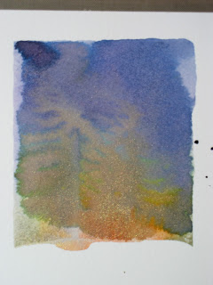
     So here goes. I took the Hero Arts Starry Night stamp and inked it with all Ranger Inks in Dusty Concord, Chipped Sapphire, Faded Jeans,  Spiced Marmalade, Scattered Straw, Fired Brick and Worn Lipstick. I then spritzed the stamp with some water and added Perfect Pearls. The first example, was my first try, and I didn't think I had used quite enough water, because my mini mister was running out, so the edges didn't blend as much as I would have liked. In the second one you can see, I overcompensated ;- ) Then I got better in the third, but I had used too much Perfect Pearls (might have had something to do with opening it upside down and not wanting to waste any) and so it blocked the transfer of the ink in spots, especially on the setting sun. On trying to repair that, I smeared it. I can recover it by cutting off the snow and adding that part separate or backing it in white. I decided I liked the effect of the first one after all and will hold on to the other two for something else (probably use the second one to punch something out of or as backing paper). You can't see the pearls in the photos, but it gave it a nice iridescence.


Here is the front.


     Both the blue and grey papers are from Core'dinations Super Assortment from Hobby Lobby. I used Viva Decor's Holo Iridescent Glitter Liner on the snow and some of the branches, as well as Gelly Roll Clear Star pen on the stars. The font is the Word Art from Gypsy Wanderings and it has a shadow. I had difficulty deciding on the size because it's shown with the Happy over Birthday, but they are not attached and I needed them side by side. I started an 1.25 inches and I believe I finally cut it at 2 inches. Trial and error all the way. I used a pearl to dot the I. Another thing you can't see is I ran the white sentiment through my Xyron and added Martha Stewart Crystal Fine Glitter.


     The inside is the same papers with a digital sentiment. I used Snell bd Bold for the main font and Snowcaps for the "B"'s and "P". I then added Glitter Liner to the tops of the capitol B's and P. The embellishments are Silver Holographic Snowflakes, but the top of the envelope was gone, so I'm not sure whose they are. What would I do differently? I'd probably put the Happy and the Birthday closer together on the front. Otherwise, I'm pretty happy with this card. Let me know what you think. Thanks for spending some of you very precious time with me.