That evening, going through blogs, I saw the main, original idea sparked again on Lucy Abrams blog. Now, the next morning, when I confidently went to execute this great idea, it dawned on me, I think I used those elements on her daughters wedding card, this past summer :- ( I went to check my photo library and there was no photo of her daughters card. It is one of the 3 or 4 that I forgot to photograph. >.< Well, I can't chance that, so time for a new idea. Looking around my table there is a stamp I've wanted to use, but haven't had the time to really play with, with some techniques that I wanted to try. AHA!
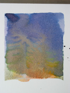
So here goes. I took the Hero Arts Starry Night stamp and inked it with all Ranger Inks in Dusty Concord, Chipped Sapphire, Faded Jeans, Spiced Marmalade, Scattered Straw, Fired Brick and Worn Lipstick. I then spritzed the stamp with some water and added Perfect Pearls. The first example, was my first try, and I didn't think I had used quite enough water, because my mini mister was running out, so the edges didn't blend as much as I would have liked. In the second one you can see, I overcompensated ;- ) Then I got better in the third, but I had used too much Perfect Pearls (might have had something to do with opening it upside down and not wanting to waste any) and so it blocked the transfer of the ink in spots, especially on the setting sun. On trying to repair that, I smeared it. I can recover it by cutting off the snow and adding that part separate or backing it in white. I decided I liked the effect of the first one after all and will hold on to the other two for something else (probably use the second one to punch something out of or as backing paper). You can't see the pearls in the photos, but it gave it a nice iridescence.
Here is the front.
Both the blue and grey papers are from Core'dinations Super Assortment from Hobby Lobby. I used Viva Decor's Holo Iridescent Glitter Liner on the snow and some of the branches, as well as Gelly Roll Clear Star pen on the stars. The font is the Word Art from Gypsy Wanderings and it has a shadow. I had difficulty deciding on the size because it's shown with the Happy over Birthday, but they are not attached and I needed them side by side. I started an 1.25 inches and I believe I finally cut it at 2 inches. Trial and error all the way. I used a pearl to dot the I. Another thing you can't see is I ran the white sentiment through my Xyron and added Martha Stewart Crystal Fine Glitter.
The inside is the same papers with a digital sentiment. I used Snell bd Bold for the main font and Snowcaps for the "B"'s and "P". I then added Glitter Liner to the tops of the capitol B's and P. The embellishments are Silver Holographic Snowflakes, but the top of the envelope was gone, so I'm not sure whose they are. What would I do differently? I'd probably put the Happy and the Birthday closer together on the front. Otherwise, I'm pretty happy with this card. Let me know what you think. Thanks for spending some of you very precious time with me.


1 comment:
OK....I don't know what any of those instructions mean. John is trying to explain it to me. WOW! I thought just the trees were the stamps, and was trying to figure out how you got it so white! Love the card, and am glad I made the cut.
I know that you do the blog to inspire others to be creative....but there are those of us who just like to enjoy your creativity, isn't that really why you make all of these beautiful things?
Post a Comment