Showing posts with label Hero Arts. Show all posts

Monday, March 12, 2012

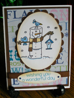
Cocoa cards on their way to college ;- )

     Well, the cards have been on their way for a few days now, but my husband believes in sharing and shared his nasty cold virus with me (which may have some home from college in the first place with our son, but he doesn't usually get very sick.) There are 14 cards in total, but only 10 were still here for there photo shoot ;- ) The cards for the guys all use the same pattern paper, while I use a few different pattern papers on the ones for the gals.

     The image is from Bugaboo Digi Stamp and I won it during a blog hop from Cely (Creating in Carolina) back during Christmas in July. I colored it digitally, which sure makes making multiples easy ;- ) and cut them out with the large oval nestability. The pattern papers are all from DCWV Holiday Collection Christmas Stack. The mats are a Bazzil paper from Archiver. The ribbon was scavenged from boxes of Godiva Chocolates over many years ;- ) (Yea! Hubby) I used Viva Decor Pearl Pens, to add the pearl dots, on the sentiment, which is from Hero Arts Big Hugs (stamped with Tumbled Glass Distress Ink and clear embossed) and also Sickles on the hearts for the gal cards, but only Stardust pens by Sakura to the hearts on the guy cards. Oh, and of course there is inking! The oval for the sentiment was cut on the Cricut using the Gypsy and Accent Essentials, after making sure the keep proportions was unchecked. A friend came over the first day and helped me cut our all of the images, mats, paper and card bases, so a special shout-out to Diana for her help!!!! Her daughter will get her card this week ;- )



     On the first cards, which went out before I took photos, I used pattern paper on the inside, but realized that the sentiment inside covered so much, that it was a waste, so I then just used more of the Bazzil card stock to mat the sentiment. The fonts in the sentiment are LD Penelope (from Lettering Delights) and Kingthings Christmas (the snowy font, available as a freebie Here or at dafont, but dafont was down for maintenance when I went to link to them.) I had added a post-it to the cocoa, because it required the addition of milk instead of water and I wanted to be sure they noticed that. I embossed a stamp from Inkadinkadoo's Warm Holiday Wishes with silver glitter finish.


     Sorry, about the photo, but the sun came out from behind the clouds and I usually photo after the sun is well past this window, but they needed to get into their envelopes. I created eveloboxes with The Ultimate Crafter's Companion for each of these cards (sorry, I didn't photo them), so there was enough room for them to fit. My son said his college treated his card like a package and sent him an e-mail when it arrived and he had to pick it up from the package person.

     Hope your week is full of inspiration and warm weather. We are expecting great weather here ;- ) Thanks for stopping by and I'd appreciating hearing from you! Your comments mean so much to me. Feel free to ask me any questions too!

Tuesday, February 28, 2012

Easel card for a challenge.

     Hey, long time no see >.< Sorry about that. I have been working on a card for my college students and three have been mailed, but I forgot to take photos of them (hurrying to get those out the door, my son comes home on Friday, Yippeee!) Should have more of them done soon and then I'll post those (only 11 more to go, hee hee.) They are cocoa cards.

     Today's card is for the Progressive Challenge over at Crafter's Digital Art Center (here.) This is the last leg of this group of the Progressive, so you can get in the next round, if you would like to join. We get they greatest images to work with and the next group is free as long as you use one from the current group in a project within the challenge period (usually 2 weeks.) The first group is free and if you missed the first group you can join in for $1 and as I said we will be starting with a new first group on March 1st.

     From the title, you can tell todays' card is also an easel card ;- ) You are a quick group!  I used the image provided by A Day For Daises which is perfect for a card for my best friend from grammar school's daughter. I colored in in PhotoShop Elements. The only thing fancy was a multi-bristle brush you would find in the Assorted Brushes at the bottom left. It kind of looks like half a squiggly doodled spider, LOL. I used that with hair highlights and lowlights and dabbed or stippled with it on a base colored hair to make the hair look more realistic. I just kind of messed around with it until I got something I liked. You have to love that undo button. Only remember with doing this dabbing you can only undo so far (depending on how many levels of undo you have set) and you might dab a lot of times, if you use a small brush which will look better.

     The solid color papers are from Core'dinatiions and the pattern paper is from Paper Studio's Four Seasons paper pack, which is available at Hobby Lobby and has so many great patterns. I cut the scalloped circle with Quick Kutz Nesting Circle Dies, but I cut the circle with the Martha Stewart Circle Cutter, because I didn't want a circle as large as the one that came with the Quick Kutz set. For the oval sentiment I used Nestabilities Large Oval and Large Scalloped Oval. I inked the card edges and the image with Dusty Concord Distress Ink. The image also has some Tumbled Glass Distress Ink on it. I wanted to know back some of the starkness of the white. The sentiment is from Hero Arts Sweet Wonderful You and is stamped with Tumbled Glass Distress Ink. The ballet slippers with the bow is a free SVG from SVG Cuts, which I used Sure Cuts A Lot 2 and my Expression to cut. They have lots of free images and the ballet slippers are still available here.  You can check out SVG Cuts here. There is a link to the Sure Cuts A Lot software on my sidebar. I inked the edges of the ballet slippers and the bow with a Copic to give it more dimension and popped up the bow.


     Thanks for fluttering by today. I'm really glad that you were here. I do love reading your comments. Please leave one before you go ;- ) Have a wonderfully creative week!

Saturday, February 11, 2012

Heart Balloons at The Outlawz

     Today's card uses Sandi Huggert's image for The Outlaws Creative Freebie Challenge here. You can find Sandi's blog and images here. I decided to make this for a friend's daughter who didn't go away to college, so she doesn't usually get cards when I do my mailings to those away at college. I decided she could use a card too ;- ) My original vision was to paint the whole image with glitter and early on, I did some tests on that, but put it aside (which is never a good thing with me.) So here I am coloring in PhotoShop (which I would have done anyway so there would be color under the glitter ;- ) I tried to stay true to my vision/inspiration and went over the part I had planned to use silver glitter on with the Stardust glitter pen by Sakura. I did paint the red hearts with Martha Stewart glitter. I used black gel pen on the purple balloon. I added red Martha Stewart twine for the balloon strings. The circle and scalloped circle were cut with the Quick Kuts die set made to go with some of the Hero Arts stamps. The sentiment is from Hero Arts Sweet Wonderful You and was embossed with Red Dragon embossing powder from Stampendous. I inked it with Dusty Concord Distress ink. The rick rack was cut with a die from The Scrapping Cottage. Those of you with keen eyes will notice that I put the border on upside down >.< Just shows how things are going in my current state of craziness. I also should have rounded the corners.


     Thanks for stopping by two days in a row. I've have another progressive due on Mon. So I better get to work ;- ) Have a great rest of your weekend!

Friday, December 9, 2011

14 tags and the Cookies are on the Way for Finals! Also Freebie links!

     Well, you're probably wondering were I've been. the party's over and no word from me. I did also have a birthday this week and then I heard then some of my college students were on their way home this weekend!!! Yikes! The cookies haven't gone out, what is happening with this thing called time? Now I don't know what is happen to the college system, but it seems some of them just had to write mostly papers, instead of actually taking finals. What's with that. Don't they know it takes me time to make the 14 tags and mail the cookies? It takes days just to go over all of the possibilities of things that could be used on a tag!

     I finally narrowed it down to cutting the front of the tag with the Cricut's Christmas Cheer cartridge using the Joy tag. I used Design Studio to size it and lay it out with 3 tags on an 8 1/2 by 11 sheet of cardstock. Seemed like a good idea, until I went to cut the solid back and Design Studio can't hide the cuts (contours) of the word JOY to make a solid tag, so I had to do the backs with the Gypsy and due to the way the one program allows you to do the size verses the other, the backs are just a bit smaller. Should have used the Gypsy for both parts. The Baby Jesus in the manger is an SVG purchased from Svgcuts.com and is part of the set O Holy Night and cut it with Sure Cuts A Lot. You can find the link on my sidebar. The sentiment is a digital image from Meljen's Designs that I got as a freebie. You can find her images here. She usually has freebies on Mondays. The red paper is a digital paper freebie from Papercraft Inspirations Issue 94 (online). Go here and the click downloads to check out all of their goodies ;- ) Are you beginning to see a bit of a trend, ha ha. I love freebies! The green paper, between the front and back tag is from Sue at PSP Crafting Gallery. You can find her freebies and those of some others here.  The final freebie is the ticket, which is a Member freebie (membership is free), from Crafter's Companion on the UK site, here. It's part of the Nov. set.  The digital freebies include papers, digital ribbons, tags, buttons and other elements all designed to go together. There is a new set every month. Most of the tag was embossed with Sizzix's Snowflake folder from the Christmas set (thanks hubby for helping out!) Yes, my DH know how to run the Big Kick ;- ) Everything was inked with distress inks to make them pop a bit and there is glitter pen and white gel pen on the holly berries.


     On the back, the gold metallic embossed sentiment is from Hero Arts and the rest is inked with Fired Brick distress ink.  The ribbon is from Michaels.


And here they are with their cookies, waiting to get boxed up.

     Here are a couple of photos of the food from our party. We did it mostly potluck this year for the first time. Yummy!


And finally, this is what you might have taken home if you participated in our White Elephant ;- )

     Thanks for dropping by and making all the way through the post ;- ) Have a wonderful weekend and please leave a comment before you go. They really mean so much to  me!

Sunday, October 30, 2011

Sweet Birthday.

     This card is made for my Aunt. I used one of the images from the Crafter's Digital Art Center's (CDAC) Progressive Challenge. We're in the 5th round and this image is by SSBS Design.  This post is going to be short, because I have to be up at 4am to get my husband to the hospital for his surgery and I just got back from driving my sone back to college. I colored the image in PhotoShop using a few patterns on the basket, the gingerbread men and her dress and headband. You really can only see the one on her headband after the image was sized to fit my card, though the gingerbread men look a bit more cookie-like ;- ) I mixed and swirled colors to make her hair. There is Diamond Glaze on her shoe to make it look like patent leather and glitter gel pen on the gingerbread men. I used Broken China Distress Ink. The papers are DCWV Holiday Collection Christmas Stack from last year. The gems are from Hero Arts as is the sentiment and the flower from Archiver. If I had more time, I probably would have cut out more gingerbread men and popped them up (I may still her birthday is in December, but the challenge is due today ;- ) There is no inside sentiment yet, so when that is done, we'll probably review this card, LOL.
Maybe I'll remember it.


     Thanks for stopping by and please leave a comment. Thank-you so much to those of you who do. they really are much appreciated ;- )

Saturday, October 15, 2011

Anniversary Swirl

     Well, I'm still behind but I do have 1 card done ;- ) It's an anniversary card for a dear friend's (who I've known since 2nd grade and is my son's godmother) son and daughter-in-law.  I used the oval card in Cricut's Wild Card cart  (6 1/4 in. if you cut the envelope to fit a 12 in pice of paper) for this card and welded my own Happy Anniversary from the Plantin SchoolBook cart on the Gypsy using the Wisteria paper from Basic Grey adding a gem from Hero Arts for the dot in the  i and a flower from Creative Charms. In the nothing comes easy category of my life lately,  my Xyron was jammed, but fortunately the LetraTac came through for attaching the sentiment (see posts here, if you want to know more about LetraTac.)  To cover the window, I cut the blackout option and cut it in half, using only 1 oval here.


     On the inside, I made a digital sentiment using LDJ Jilligraphy font from Lettering Delights. You can find them at the affiliate link on my side bar. I also added a line element from Print Shop, which is what I laid it out in. I cut the sentiment with an oval nestibility and inked it with Distress Inks Peeled Paint and Concord Grape. The swirls are from the same Oval card in Wild Card, under the icon button and I used the Gypsy to reverse one of them. I added pearls to the ends.


     I made the matching envelope as well. I used the remaining oval, cut in half, in place of the envelope liner (I had a mail carrier to beat and waste not, want not ;- ) I might have blinged it up some if I wasn't in a hurry, but I do like the simplicity of the way it turned out, so maybe all in all it was a good thing. The green paper is Bazzil from Archivers.


     I will probably make, the now belated anniversary card that is left, the same, possibly in different colors. It will depend on what I find when I dig through the mess I made in my studio. I also will have to make a belated birthday card. She is such a good friend, she will understand and will probably get a call and maybe that will just be all she wants. She isn't a card sender, herself. Then I'm on to my next crazy bunch. I'm sure that I'm already running behind. >.< I know I need to make 2 groups to go out to the college students I send to.  I wanted to get them out before Halloween and I haven't updated my total to include the new freshman, so I don't even know how many I need to make. Though, I do know what I'm making. For the ones I sent to last year I have a design picked out and the new ones will get the same design I sent last year, ha ha!

  Thanks, as always, for stopping by. I'm glad you came.  Please feed my ego with a comment or ask any questions you might have ;- ) Have a blessed and creative day!
     

Monday, September 19, 2011

Celebration card for an Anniversary!

     Today's card is for my neighbor's anniversary. I had picked up Cricut's Wild Card cart from Menard's when they had them for $4 after a mail-in rebate. Great deal! On this cart they have a tri-fold card and envelope that was meant for New Year's Eve called Celebrate, but I thought it would make a great anniversary card. On the internet I found a few places where people had listed the largest sizes you could cut the envelopes on a 12x12 piece of paper and the corresponding size card to cut. You can find a list here at Obsessed With Scrapbooking. So for this card, I cut it at 5 1/2 inches from black Core'dinations cardstock. I cut the liner items with gold metallic cardstock and the icon (cork) from kraft cardstock and stamped it with Hero Arts Designer Woodgrain stamp then clear embossed it.  I attached the cork with pop dots. The pattern paper is Confetti from Paper Pizzaz. I found a label shape I liked on the Storybook cart (the Thank You image page) and cut it out in red and a slightly smaller  one from printer paper ( I used the Gypsy to get the sizes I wanted) that I had already printed their names on. The font I used is Tango. I attached this with pop dots. In order to keep the card from popping open, I made a band to slip over the card and attached the sentiment on it. I cut the sentiment from Lyrical Letters. Cutting it at this size makes it very delicate and prone to tearing, so it had to be pieced a bit and I used the LetraTac I had mentioned back on this post to attach it. You can find it online at Dick Blicks here. I get nothing for this, I just think it's cool.


     This card wasn't meant to be a gift card holder, but since I was going to cover the front and giving them a gift card, I decided to cut slits in it to hold the gift card. I cut a piece of the pattern paper to cover that at the bottom and used a piece of the same paper as a mat for the sentiment. I created the sentiment digitally and the font is SNF Infinity from Scrap N Fonts. Currently Scrap N Fonts is having a Dollar Sale. You can find their sale here.


     Since I added the band, the envelope won't close right, but I thought I'd show it here anyway.  Cool envelope, huh ; - )Sorry, I hadn't realized it was out of focus or I would have retaken the photo during the day >.<


     Well, thanks for stopping by and spending some time with me today. Please leave a comment, so that I know you were here. They always brighten my day ;- ) Have a wonder-filled week!

Friday, September 16, 2011

It's finally feeling like fall here, and Free PhotoShop Brush links

     It's finally feeling like fall and I can't wait for the next few days when it gets warmer again ;- ) It's suppose to return to the mid to upper 70's maybe even 80, so much nicer, then these lows in the 30's. The weather however, caused me to come up with today's card, which is a Thinking of You card. The papers are from Four Seasons Paper Value Pack by The Paper Studio. I came up with the idea for the card, while lying in bed early one morning. I didn't expect the image to be so big, but then I didn't have the stamps with me, ha ha. Since the image is so large, the card is 8 inches by 5 inches. I used a Hero Arts stamp for the tall pumpkin and a Stampabilities stamp for the rounder one. This is actually the first time that I masked while stamping and also the first time I colored an image by painting it with Distress Inks. The I went over some of the details with a colored pencil and some with a brown glitter gel pen from Sakura. I really liked how it turned out.  The sentiment is stamped with Clear Stamps Greetings and Mementos ink, adding a couple of Hero Arts gems. On the bottom panel, I added some popped up embellishments, that I had left over from when I use to do the Youth bulletin board and don't know whose they are.


     I've made this card for my aunt, whose eyesight has deteriorated due to diabetes, so the digital sentiment on the inside is quite large and I will include a personal letter as well. The font is Lobster Two Bold which was designed by Pablo Impallari and can be found at Font Squirrel for free here. The pumpkin graphic is actually a very cool PhotoShop brush called Fall Preview Sabordes. Which is a free preview that includes 5 brushes designed by Michael Murdock of Sabor Designs, that are actually sketches. You can find them at Brusheesy here. The full set (20 brushes) are available for $5. The leaves are also found at Brusheesy and include 50 brushes (leaves) from hawksmont and you can find them here (also free.) I had some other great finds, but didn't use them here ;- )


     So, it took a bit before I got this posted, because I was trying out some new things and checking out some videos. It's hard to balance actually creating with an end product in mind and creating with just experimenting and trying new techniques, but no actual output achieved, other than getting messy. Sometimes, I just like to get messy and learn something new, but it's not for show, oh, no! It's often for the circular file, ha ha, at least for now.
     Thanks for stopping by and checking out my newest card. Please leave a comment if you have time. Even if it's just to say Hi, I like to know you were here. It energizes me. Have a glorious weekend.

Thursday, September 1, 2011

Stop and smell the roses.

     The card I have for today, was made for a dear friend's daughter. I prepare you, for when you read the sentiment on the inside ;- ) I'm sure I will be getting a call from her mother, who was the Matron of Honor at my wedding. The image is a Hero Arts stamp and I painted it with water colors. I added and embellishment from Creative Charms. The pattern paper is from Paper Studio, as is the paper strip I used for the sentiment. I used a glitter pen over the blue Happy Birthday words and it darkened the whole look of the sentiment a bit too much, so I added the white dashes with a white Signo Gel pen to the top and bottom of the sentiment.

     I did struggle with what to write on the inside. It is the hardest part of making cards for me. Everything always seems so trite. Maria still has one of the first digital cards I ever made, going back to the Mac II with the first version of Print Shop, on a very dottie, dot matrix printer (maybe 26 years.) She also is the first recipient, of the first cut and pieced card I ever made, which was for her wedding shower (2 1/2 years ago). That's a lot of written sentiments. This sentiment was done digitally with a combination of Print Shop, using LD Penelope from Lettering Delights for the font and Photoshop Elements, using Inobscuro roses brushes to make the rose background. I "stamped" the rose, used the find edges filter with a darker color and then dragged it into Print Shop. I think it gave a very nice and artistic effect. I went over the rose outlines with a clear glitter pen. You can see the glitter better in the second photo of the inside, which has the colors wrong because of the setting sun, but does show the effect of the glitter. Just noticed, while looking at the photo, the font used for "Maria" is Black Rose. It's a free font that you can get from any number of free sites. I also went over the "29" with a gel pen.

 Click to make larger
Click to make larger - then you can see the glitter better, so I don't sound crazy ;- )

     As long as I'm talking about roses, Here are a few photos I took yesterday, of the roses from my new bush that we planted this year. OK, in the vase there is a ringer as well ;- ) I love the ruffled petals on this yellow rose.


     Thanks for coming by and spending some time here today. Please leave a comment. They really mean a lot to me. Have a blessed day!

Friday, August 26, 2011

Quick note for a friend

     Well, my friends have been busy taking care of me. Two lunches out, in two days and a check up phone call from another. I almost didn't get this card done for one of them, who changed jobs, kind of, by switching as the librarian of an associated parochial school, since they closed her school this year (not the same one that I made the birthday card for). Now instead of a 5 min. commute, she has a 45 min. commute for the part-time job. So, this was a big decision and change for her (as well as the school being larger, so she has more classes). I wanted to send her a card of support. In between having lunch with her one day and lunch with a neighbor the next, I quickly put together, today's card.

I used my  Cricut Imagine and the Imagine More cart to print and cut all the images. The bird and it's wing are pop dotted. I used all of the layers on the front and added gel and glitter pens to the images to add some extra texture. I used my Fisker's cutter to trim the edge with the scallop decorative blade going back and forth to get a different edge. The sentiment is from Hero Arts and  is stamped in Chipped Sapphire by Ranger.


   The inside, is the first 2 layers from the same image as the front and I left it basically plain, to write my message. On the bottom, I stamped a bird from Hero Arts and a Bible verse from Clear Dollar Stamps, both in Chipped Sapphire.


     What could I have done differently? I should have made the notes on the front larger. I had meant to, but the first one started out small and tentative and then I was stuck >.< I wanted a bit more glitter and sparkle, but my gel pen colors matched better.  Maybe, some other glittery embellishment added on. On the inside, I thought about coloring the bird and I may still, when I write the note.

Thanks for stopping by and spending some time with me. Please, say hi, so that I know you were here. Exercise your creative muscle today!

Sunday, July 31, 2011

Two quick cards

     Well, I was down to the wire on two cards. It was a busy week and then I hadn't been feeling well, causing me not to get these two cards done earlier. So, here I was needing to get them done, before the mail carrier got here. Fortunately, I had a few tricks up my sleeve. I had picked up some note cards from Studio g in the Dollar Bin at Michaels', that had pre-cut windows. I'd also had on hand an assortment of embellishments that I've picked up over time, when there have been sales at Michaels' and JoAnn's. These are from JoAnn's Craft Essential 's line.  The front is embossed with Divine Swirls. The stamp, showing through the window of the anniversary card, is from Stampabilities. It was stamped with Big and Bossy and embossed with gold metallic embossing powder. Hint: Use a dryer sheet to wipe the area where you are going to emboss before you stamp to reduce the amount of powder that clings to unwanted areas. I wish I would remember this the ahead of time, every time ;- ) I colored it with both yellow gel and yellow glitter pens to make a champaign look and went over the glasses with Diamond Glaze.  Used my heat tool to speed drying.


     The inside sentiment is from Inkadinkadoo.


     The birthday card follows the same formula, only the stamps are from Hero Arts, made for Archiver. I embossed it with Swiss Dots.  Hint: I had to run it through twice and doing this would cause a section of the dots to de-boss, so I lined it up, to be the area where I would put my sentiment/embellishment. Always plan ahead - an interesting concept for me ;- ) OK, it was a happy accident the first time, but my pickiness, made me do this one a second time and I did it intentionally that time, so there!


It's really more red and maroon than pink.

     For quickie cards, I think they turned out pretty good. Kind of like the less expensive line of cards, but still with that homemade touch. We all have those times when we are out of time. The anniversary couple's daughter has a birthday this week and I need to make a unicorn card for her. So, they will get the full custom treatment then ;- ) As it turned out, it was good they were fast. I didn't just have to beat the mail carrier, but get to the post office before it closed, because I was out of stamps and traffic was horrendous because of a parade. Some days nothing is easy ;- )

     Thanks for stopping by, during your busy summer (if your north of the equator, like me.) Please leave a comment because the fuel me. Have a Blessed Sunday!

Tuesday, July 26, 2011

An Adventure Birthday Card

     Today's card is for a friend's husband. Don't I ever get to make cards for women? He bought kayaks this summer, so I thought I'd use that as a focal point for his card. I went through the Life's a Beach cart and found a photo card with waves on it (page 45). I decided to use the Gypsy to weld a sun, from the page before, to the upper left corner of the frame and give it more of a scenic look. I then cut it out on my Expression. The sun was 2 inches, so I also cut out a 2 inch sun in yellow from Core'dinations paper and enhanced it with yellow gel pen (the circle outline) and Copic markers (the nose and lips) and added it with pop dots. I added small black pearls for eyes. I backed the frame with a lighter blue paper to make a sky. I edged the waves with Puffy Appliqué Markers that puff up when you heat them. The heat and humidity made them a bit runny, but they still worked ok. I attached the kayak, which was from Jolee. The sentiment is from Hero Arts' Big Hugs and was stamped with Tsukineko Rocket Red Gold.

  Click to enlarge to see details.

     I cut the inside papers with a wavy blade, on my paper cutter and the sentiment was made digitally in Print Shop. The fonts are Aloe,  Carlisle and LDJ Jilligraphy ( the first two are free fonts and the last is from Lettering Delights - see link in my side bar.) The lifejacket came on the sticker sheet with the kayak and the balloon is from Jolee's All That Bling, available at my Walmart.


     What would I do differently? Well, the light blue background could be embossed, maybe with divine swirls? I'd have to try it, to see if I'd like it or not. Fairly simple, but I think it's a nice card all of the same. A friend of mine wondered, if guys really appreciated a hand-made card and all of the time that goes in to it. I think it might depend on the guy. Some, I'd put a lot more work into it, and they would.  I don't think he'd appreciate the time it would take me to do a lot of hand coloring though. 

This card came together pretty easily. I learned that if you have some tearing, while you are cutting with your Cricut, it might not be your blade. It might be time for a new mat. The places where my mat was less sticky, was where the waves were tearing, everything else cut fine. Using a new mat, caused it to cut perfectly, all with the same settings. 

     Thanks for coming by. Please leave me a few words in the comments, so that I know you were here and that I'm not writing to myself ;- ) Have a super week.

Tuesday, July 19, 2011

It's a heat wave.

     Sorry, I should have had this posted on Monday, but it's been way too hot to touch a computer. I called friends, watered flowers and  read a book instead ;- ) I finally relented, late last night and put the air conditioning on, so we could sleep. The poor puppy was very thankful, being a Norwegian Elkhound and all.

     Todays card is for a little boy who is turning 2. I used the Imagine and Nursery Tails to make this one. I used the image from Nursery Tales in layers, changing the first layer from pink print to green print, since it was for a boy and popped up the layers. I added gel pen details and Diamond Glaze to add more interest. I also added a mat layer, using the rectangles (8 1/2:11 ratio) from the images resident on the machine and filled it with a pattern from the Nursery Tales cart. Sentiment is from Hero Arts.

  Click to enlarge

     The inside sentiment was created digitally using Print Shop. The font is SNF Jester Play from Scrap n Fonts. You can find them here if you are interested. The number 2 was cut 2x at 2 inches from the Birthday Bash cart. One time I filled it with yellow on the Imagine and one time with the pattern I used on the background mat. I stacked and popped them, inking the edges to cover the white.  I added the birds I had left from the front (I had cut and 2 sets of birds and clouds).


     What would I have done differently? I might have worked more on details on the front, but again it was  (and is) HOT and I was afraid I wouldn't do a very neat job. I felt that the image looked a bit flat, that's why I added the gel pen details, that I did and might have added more. I also needed it to dry, so that I could mail it the next morning. If it were for a girl, I definitely would have added more glittery bling ;- )

     Well, I hope if you are in this heat too, that you are enjoying refreshing drinks and staying cool. I plan on enjoying the air conditioning at the CHA SuperShow later in the week, since this heat wave is expected to last past the weekend. I know it won' be the same as in the past, but I hope to have some fun anyway. Maybe the movie theater too. Thanks for stopping by and please leave a comment, it will make me feel cooler ;- )

Saturday, July 9, 2011

Ladybug, little girl card.

     Today's card is from Cricut's Birthday Bash cart. I made this card for the daughter of a friend and ex-colleague of my husband. I cut the ladybug, base and the number 5, (which comes from the next page of the handbook) on 3 1/4 inches. The pink and green cardstock is Bazzill and the pattern paper is Paper Studio from Hobby Lobby. The ladybug is embossed with swiss dots. I used frosted lace stickles on the black spots and diamond glaze on the antenna tips.


     For the inside, I used the sentiment from the same page as the ladybug. I doodled on it with a green glitter gel pen, to give it some interest and added a gem, from Hero Arts, to one of the i's.


     What would I do differently? I might have made the ladybug smaller. I thought about faux stitching the pink layer, but wasn't sure if I could do it neat enough. Should try that before I glue it down. Maybe texture emboss the inside pink layer, but I don't know.

     I don't know why I think I'm further along than I am after I pick the image I'm going to use and maybe the sentiment. Sometimes, I even have a basic layout in mind, but I seem to forget how long it takes to pick the papers for the pieces, if I'm cutting the image out, decide on embellishments, decide the total color scheme, choose how the sentiment will be displayed and all the other "little"decisions like that (embossing, pens, glitter, ribbon.........).  Fortunately, this card isn't needed until the end of the month, but I have others I put aside because I thought I knew what I was doing with this one, it would be quick, ha. It always takes longer than I thought. I need to hunt for supplies for 2 of the others, for the basic idea rattling around in my head, that will of course take 10X longer than I anticipate ;- )

     Thanks for checking out my card and my random thoughts. Please, leave me a comment if you've got a moment. I really appreciate them. Have a blessed day!