Showing posts with label Ranger. Show all posts

Friday, August 26, 2011

Quick note for a friend

     Well, my friends have been busy taking care of me. Two lunches out, in two days and a check up phone call from another. I almost didn't get this card done for one of them, who changed jobs, kind of, by switching as the librarian of an associated parochial school, since they closed her school this year (not the same one that I made the birthday card for). Now instead of a 5 min. commute, she has a 45 min. commute for the part-time job. So, this was a big decision and change for her (as well as the school being larger, so she has more classes). I wanted to send her a card of support. In between having lunch with her one day and lunch with a neighbor the next, I quickly put together, today's card.

I used my  Cricut Imagine and the Imagine More cart to print and cut all the images. The bird and it's wing are pop dotted. I used all of the layers on the front and added gel and glitter pens to the images to add some extra texture. I used my Fisker's cutter to trim the edge with the scallop decorative blade going back and forth to get a different edge. The sentiment is from Hero Arts and  is stamped in Chipped Sapphire by Ranger.


   The inside, is the first 2 layers from the same image as the front and I left it basically plain, to write my message. On the bottom, I stamped a bird from Hero Arts and a Bible verse from Clear Dollar Stamps, both in Chipped Sapphire.


     What could I have done differently? I should have made the notes on the front larger. I had meant to, but the first one started out small and tentative and then I was stuck >.< I wanted a bit more glitter and sparkle, but my gel pen colors matched better.  Maybe, some other glittery embellishment added on. On the inside, I thought about coloring the bird and I may still, when I write the note.

Thanks for stopping by and spending some time with me. Please, say hi, so that I know you were here. Exercise your creative muscle today!

Tuesday, August 23, 2011

Back to the beach ;- )

     Sorry, I've been AWOL again. I've had some cluster headache issues and I have gotten my son back to college. I thought I had a great early start on today's card, when I started it last week.  Good thing, because I ended coming down to the wire. This card is for a good friend for whom I volunteered, when my son went to K- 8th grade. She was and is a Lutheran School librarian. I also volunteered for her predecessor, before I was pregnant. Ruth likes lighthouses, so I used the one from Cricut's Life's a Beach cartridge as my main image.  The white is Walmart cardstock and the blue is Core'dinations (like the texture.) The layers didn't cut as I would have expected and the white left spaces, so I re-cut the image a bit bigger and used those white cut outs popped up on the original frame. I used a gem for the light. The waves are a border feature cut of the wave image also from Life's a Beach. I used my Gypsy to set up the cut so that the white stripes would appear at the tops of the waves. The seagulls are the shifted cut from the lighthouse image. I edged them with a sharpie. The sentiment stamp is from the Scrappy Cat set  called Cardmaker's Dream. I hand wrote her name. I think the colors would also work well for a guy card with a less scripty (I know it's not really a word) font for the sentiment.


     The sentiment on the inside was done digitally and the font is Apple Casual. The elements were also cut from Life's a Beach. I edged the bottom layer of the pelican with a grey Copic marker to help him stand out where his head is above the blue. I also popped up his wing. The pier piling was inked with Ranger Tea Dye Ink. The bottom was sponged with Ranger Tumbled Glass and I used the negative of a scalloped oval cut I had to mask the top of the area, moving it around as I sponged, just to give a background for the images, mainly, because the pelican was white. I used a brown sharpie at the bottom of the images to ground them.


     All in all, I was very happy with the way this card turned out. What would I do differently? I might have popped up the seagulls. I debated a bit with myself about that one and then just glued them flat. I might have also given them eyes. I couldn't remember if you can see there eyes at that distance and didn't bother to go and look it up. I'm guessing you probably can. I should have used Swiss Dots on the brown bottom of the front. So, those are some things that could probably make the card better.

Thanks for dropping by and I'll try to be more consistent in my posting. Sept. is a busy card month, so I should have a lot to post. I have been practicing my doodling and drawing ( just cartoons ;- ) but that's creative growth for me, lol. Though these aren't things I would post. Please, leave me a comment, so that  I know that you were here. Have a week of fun and creativity!

Saturday, March 19, 2011

Birds are singing and I made a masculine birthday card.

     Have you ever gone into your craft room and thought, I'll use a Cricut cartridge that will make my card easy? Well, that was my plan. Only, I ended up choosing an image that had a number of cuts and it was also a  masculine card ;- ) Well, it wasn't that hard only a bit time consuming. The weather was nice enough to have the window open, so I could hear the robins singing. The Cubs were on TV. I could almost believe it was summer. So, it was a nice time crafting.
    
     I decided to use Basic Grey's Granola pack because it's one of my favorite for men. I decided to make the bird on the pennant banner, from Birthday Bash, for the front. To work out the colors, I numbered the cuts on the handbook and numbered the corresponding colors of paper in the paper pack. This made it easy to remember, what I'd decided to cut out in which color. I figured I needed to see it, to decide if I liked it. I'm not good at visualizing colors together. So here it is.


     I wrote on the pennants with a Sargent Liquid Metals marker. It matched the Distress Tumbled Glass Ink, I used with the Hero Arts sentiment, pretty well. I used Judikins  diamond glaze on the birds beak. The legs were so small, I decided to draw them on, but not much shows up well on black. Long ago, I had purchased some puffy fabric markers, that you heat to make them puff up. These worked very well, I will need to use this effect on more cards. Here is the bird detail.


     Someone had mentioned them on a blog, but it was over a year ago and I can't remember whom. I was never able to find them in a store. I finally found these on the internet. Here they are, if you are interested.


     The inside came from the same cart (Birthday Bash), but was the phrase from the image with 2 birds holding a ribbon type banner. The yellow paper was some pattern paper I had in scraps. I believe it's from Hobby Lobby. It's the same as the bird's beak on the front. I popped up this sentiment. All it needs is a signature. This is going to a male in his late teens.


     What would I do differently? I don't know. Right now, I'm pretty happy with it. What do you think? Now I just have to be sure to mail it on time. He has an April 1st birthday and I always miss the birthdays at the beginning of the month. Even when I've got the cards done. The new month just sneak up on me. Kind of like the weekends ;- ) Have a great one. Comments are very appreciated!

Wednesday, February 23, 2011

The Guys Cocoa Packet Cards a Couple of Baptism Cards

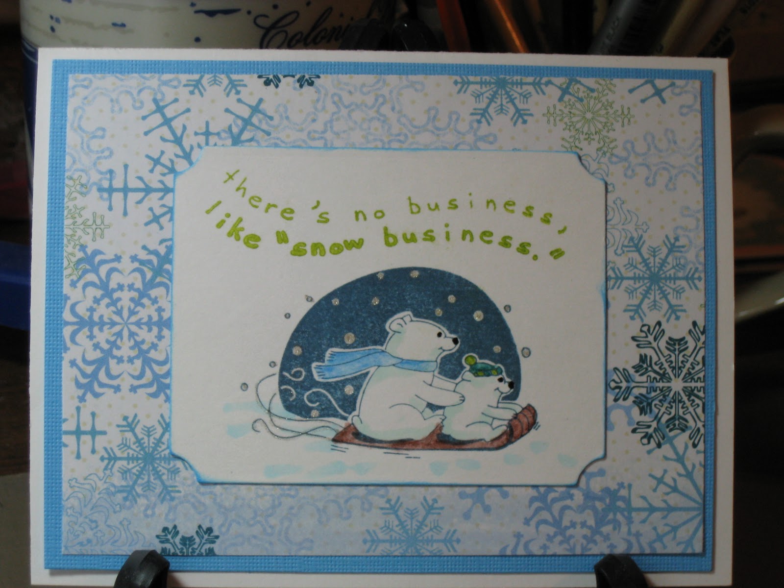
     Well, I had a productive day today. I went to lunch with a friend of mine to celebrate my birthday belatedly (my birthday is in December, but we had family medical things going on and it wasn't a good time). After she left, I started some laundry and headed up to the craft room. I worked on the male counter-part of the cocoa pocket card that a posted a few days ago. For this version I used a patterned paper from the DCWV Holiday Collection Christmas Stack. I used the same Inkadinkado Christmas Characters Stamp and colored it to match the paper, with Steadtler Watercolor pencils, Gelly Roll Clear Star for the snowflakes and trails behind the sled and a black glaze pen for the eyes and nose. I also used the same Copics BG10 on the bears and B00 to accent the snow and ground the image. The white rectangle was cut with a nestability. The sentiment was stamped with ink from Color Box's Petal Point Pinwheel collection. I also used the blue from the same collection to ink the sides of the white rectangle.


     Here are the two designs together.

If you'd like the directions for the cocoa pocket card, you can find it on the second post below this one.

     While ink was drying on this I worked on cards that I still needed to make for a gift for the Youth Director at my Church. If you've been following the saga since the beginning, I was making her some cards as a belated Christmas present (part of the December thing). The cards I've already given her are posted earlier on this blog. I asked her what else she could use, thinking I'd make her about 2 more cards and she said baptism, so today that's what I made. I think I might try to make her a couple of birthday cards, also, sometime soon. 
     The 2 cards I made are basically the same except for paper color and ribbon.  For the first one I choose green paper from Paper Studio's Pastel Cardstock Pack, cut a 5 1/4 x 4 inches and embossed it with Sizzix Divine Swirls. Next I added striped vellum cut at 4 3/4 x 3 /12 inches and added silver metallic dots to the corners. The green ribbon was some I picked up at Joanne's. I cut a scalloped oval with a nestie and stamped the wood mounted Stampabilities Ornate Cross on it with Big and Bossy, then embossed it with silver metallic embossing powder. I then added the oval popping it up. The oval was cut with a nestie also and stamped with Clear Stamps Wedding Congratulations in Dark Chocolate by PaperTrey Ink. It was double popped to go over the image. The inside is very basic for me. I just left if for her to write in. The butterflies were cut from some of the scraps with a Martha Stewart punch


     You see the yellow is basically the same, only embossed with Swiss dots and stamped with Summer Sunrise ink from PaperTrey. The ribbon is Best Occasions Self-adhesive Ribbon

     What would I have done different. The yellow one was actually done first and I realized that the vellum needed to be cut smaller, so I fixed that on the green one. On the green one, I had forgotten to add the ribbon and had to sneak it under after it was glued down, but it worked, phew!  I think the ribbon on the yellow is place to high. I like the placement on the green better. Well, we won't talk about how far the laundry got, but there is always tomorrow.
     Thanks for stopping by today and visiting with me. Leave me a note if you've got a moment more.  I may not be able to post on late Friday/Early Sat. because I will be picking my son up from college for his spring break. It doesn't seem like spring, but that's what the school calendar says. Maybe that's why so many of them go south, to find spring ;- ) Until next time then.

Saturday, February 19, 2011

Cocoa Pocket Card

     I have nine college students, who live away from home, that I try to send a little love. I planned for the next card to be a pocket card that would hold a packet of cocoa. (Who knew it would warm up in the midwest.) I looked around the internet, but most of  the ones I found were more box size, or just over size. I really wanted to stay with an A2 card, if I could, so I designed one my self. While choosing my papers, I realized I had 2 designs. One for the males and one for the females. Today, I show you the one I made for the females, since that's the only I've done ;- ) I have three to make for them.

     To start I  cut the paper 5 1/2 inches by 11 inches. Then I scored it at the 2 1/2 inch point and the 6 3/4 inch point. I then rounded the corners. The second photo shows how it will look when it is folded up.


     I then choose a pink paper from Paper Studios Pastel Cardstock Pack for the bottom mat and cut it to 5 1/4 x 4 inches. The next mat is a pattern cardstock with glitter and texture, that came from a JoAnn exclusive, they had the Christmas before last called Peppermint Forest. It was cut at 5 x 3 3/4 inches. I used my nestabilities to cut the large scalloped oval and stamped it, with the sledding polar bears from Inkadinkado's Clear Stamps Christmas Characters and also, the sentiment from the same set. The image was stamped with Papertrey's Enchanted Evening Ink and the sentiment with Colorbox's Enchantment Aqua Ink. I colored the snowflakes and the swirls in the image with Gelly Roll Clear Star. The clothing on the bears and sled were colored with Steadtler  Watercolor Pencils and also some highlights on the scarf with the Gelly Roll and the hat with a White Glaze Pen. The black on the bears (nose and eyes) is a Glaze Pen and a used Copic Markers BG10 to shade the bears and B00 to give some definition to the snow and add a base to the image. I also inked it with Broken China Distress Ink.


     On the in inside, I cut a different piece of glitter, embossed cardstock from Peppermint Forest for the front of the cocoa pocket. I planned the cuts to get the images from the paper. I cut a 1 x 2 1/2  inch rectangle of the pink paper, and rounded the corners. I then used my ATG gun to tape the sides of the pocket up. I used Versamark Dazzle and a small snowflake from the Inkadoo stamp set and randomly stamped the paper, then I stamped it with a sentiment from Hero Arts Big Hugs in Tsunkinako Black Ink. Each one of these cards is a bit different inside, due to the different characters on the paper. I didn't pop up the image on the front, due to the fact that the cocoa, already makes it tight in the envelope, however, on the inside I popped up the sentiment, since it's at the bottom and below the the bulge made from the cocoa. Unfortunately, I was out of 1/16 inch pop dots, but I'm thrifty, so I cut up the surrounding paper and used that. Shown below.


     The sentiment label was inked, except for one. That was the first one I put on when I was scrambling around to find my pop dots and so I forgot to ink that one. I get distracted by one thing and forget what I meant to do, hate that.  I decided I should make tags to go in the pockets with a personal note for each one. I stamped a tag with Big and Bossy using a grouping of snowflakes stamp and filling in with the small snowflake stamp and embossed it with White Embossing Powder. My plan was to spritz it using a mini-mister filled with Turquoise Perfect Pearls, water and Broken China Re-Inker. I found that one of my mini-misters is not a mister but a mini-jet sprayer! Well, that was interesting. I dealt with that and the first tag, which is too dark, but I'll live with it . I filled a new mister and did the other 2 tags and also added Worn Lipstick Distress Ink to the tags and wiped off the excess from the embossed areas.
I added Martha Stewart twine and will write a note on the back of this one and creatively on the front of the others.


     So, there you go, 3 card down and 6 more to go. They will probably be basically the same, but with different papers, but who knows. We will see where creativity leads that day. What would I do differently? Well, I am thinking of looking for snowflake buttons for the front yet or buttons in coordinating colors. With a total of 9 cards I didn't want to get too detailed or difficult.  I think I might have papered the inside of the pockets. I also might have embossed 1 or both of the sentiments, again trying to keep it fast. Thanks for coming back and looking. Drop me a word about how you see things. 

Wednesday, February 16, 2011

A Fish Tale of a Card

     Well, I did finish the card I wanted to and I feel so ahead of schedule for a change. This is actually a March card. Woo Whoo! That won'd last long. I have 11 college students for whom I need to make cards. Anyway today's card is for a friend's husband who likes to fish. So on the front, I used a brown pattern paper from Paper Pizzaz and a blue watery print also from Paper Pizzaz. I crossed that with a piece of brown twine from Martha Stewart and added fish cut from Cricut's Paper Doll Dress Up cartridge (I think is image 43, which is the fisherman, with the accessory 3 Feature Key pressed for one and the accessory 3 Feature with the shift for the other).  I cut the at different sizes from about 1 1/2 inches to 3 1/2 inches out of  2 different patterned brown papers and 1 plain brown paper. I then inked these with Distress Tea Dye Ink to bring out the definition of the cuts and added some markings with glaze pens. I cut my digital sentiment, LDJ Noodge font from  Lettering Delights, and cut with my oval nestability. I then cut a brown mat with the next size nestability and the brown patten paper.


     Inside, I used the Life's A Beach cartridge and cut a 3 1/2 inch mermaid from page 11. The base was cut in flesh and I hid the contours of her face with the Gypsy. I also used the Gypsy to cut the layers. This allows you to cut her hair separately from her bikini top and her tail. I eliminated her flower, because I was going to use a flower from the Archiver mix as well as hiding the contours on her tail that made up her scales. I cut her hair from a brown scrap I had and used the pink glitter paper, that I used for the Valentine card on a past post, to make her bikini top. To cut her tail, I used Spellbinders Premium Foil. This is actual metal and was difficult to cut. I know my blade is close to needing to be replaced. I used glue dots to attach her tail.  I added a flower brad from Spare Parts to the flower in her hair. After the mermaid was assembled, I used a glaze pen to draw on her scales and a .05 mil pen to draw on her face. I used my Copic E25 to add depth to her hair. I used the same paper from the front, for the bottom mat and some sand-like patterned paper for the top mat. I made the digital sentiment with LDJ Jilligraphy from Lettering Delight Fonts. I added a wave border, cut from Life's A Beach (set at 3 inches wide on the Gypsy), to the bottom of the sentiment.


     I think she turned out very pretty. What would I change? Well, don't you just hate it, when you put the paper down and notice that it's crooked, just as it sticks and all the rest of the card is together? OK, I'd change that. I might have, or maybe still will add some glitter to the wave tops. Then again, this is a guy card. I don't like the squareness of the top, right, inside, sentiment corner. Tell me what you think.
Thanks for stopping by and spending some of your time here.

Tuesday, February 1, 2011

Finally, a card with a new technique.

     I mentioned in the post from January 24th, that I started one way with this card ended up somewhere else and here is the story. I started with one idea,  then I ran across some vellum sentiments that I liked, so that started pushing the card in a very black and white way. Then I found some paper which was very graphic. I'm writing this from downstairs and without going upstairs to my craft room, the memory has gotten a bit hazy already of all the elements, but when  showed the total to DH he really didn't like the main paper, which had become a focus for me. I had even tried to force the vellum sentiment to fit into one of the rounded black rectangle shapes with a white inside. Basically, the paper was all rectangles in black and white. Very bold. I stepped back and realized this wasn't where I'd meant to go in the beginning at all and now I was forcing it.
     That evening, going through blogs, I saw the main, original idea sparked again on Lucy Abrams blog. Now, the next morning, when I confidently went to execute this great idea, it dawned on me, I think I used those elements on her daughters wedding card, this past summer :- ( I went to check my photo library and there was no photo of her daughters card. It is one of the 3 or 4 that I forgot to photograph.   >.<   Well, I can't chance that, so time for a new idea. Looking around my table there is a stamp I've wanted to use, but haven't had the time to really play with, with some techniques that I wanted to try. AHA!
     So here goes. I took the Hero Arts Starry Night stamp and inked it with all Ranger Inks in Dusty Concord, Chipped Sapphire, Faded Jeans,  Spiced Marmalade, Scattered Straw, Fired Brick and Worn Lipstick. I then spritzed the stamp with some water and added Perfect Pearls. The first example, was my first try, and I didn't think I had used quite enough water, because my mini mister was running out, so the edges didn't blend as much as I would have liked. In the second one you can see, I overcompensated ;- ) Then I got better in the third, but I had used too much Perfect Pearls (might have had something to do with opening it upside down and not wanting to waste any) and so it blocked the transfer of the ink in spots, especially on the setting sun. On trying to repair that, I smeared it. I can recover it by cutting off the snow and adding that part separate or backing it in white. I decided I liked the effect of the first one after all and will hold on to the other two for something else (probably use the second one to punch something out of or as backing paper). You can't see the pearls in the photos, but it gave it a nice iridescence.


Here is the front.


     Both the blue and grey papers are from Core'dinations Super Assortment from Hobby Lobby. I used Viva Decor's Holo Iridescent Glitter Liner on the snow and some of the branches, as well as Gelly Roll Clear Star pen on the stars. The font is the Word Art from Gypsy Wanderings and it has a shadow. I had difficulty deciding on the size because it's shown with the Happy over Birthday, but they are not attached and I needed them side by side. I started an 1.25 inches and I believe I finally cut it at 2 inches. Trial and error all the way. I used a pearl to dot the I. Another thing you can't see is I ran the white sentiment through my Xyron and added Martha Stewart Crystal Fine Glitter.


     The inside is the same papers with a digital sentiment. I used Snell bd Bold for the main font and Snowcaps for the "B"'s and "P". I then added Glitter Liner to the tops of the capitol B's and P. The embellishments are Silver Holographic Snowflakes, but the top of the envelope was gone, so I'm not sure whose they are. What would I do differently? I'd probably put the Happy and the Birthday closer together on the front. Otherwise, I'm pretty happy with this card. Let me know what you think. Thanks for spending some of you very precious time with me.