
 Posts
Posts


Let's start with the card, because I haven't posted one in awhile. Today's card is for my neighbor's newborn granddaughter. Her, (the baby), name is Stella, hence the theme of the card. I used the Imagine and Nursery Tales again, because I want to get as much use out of such a baby oriented cart, when I can, being the mother of a 20 year old son in college ;- ) All of the paper and images are from this cart, except for the shooting star, which is from Everyday Paper Dolls, accessories 2, shifted. It's the accessory for the astronaut. The paper for the star is from Core'dinations Couture line. I colored the star with a Copic marker and added detail with the Starlight Glitter pen. All the images were popped up with pop dots. The sentiment is from Clear Stamps Greetings and was embossed with gold metallic embossing powder. The rose is Prima.

The papers on the inside are also from the Imagine Nursery Tales cart. The sentiment was done digitally, however the images were stamped. The star, under the word "star", was with Studio g pigment chalk ink and a stamp from Northwoods and the ones on the bottom are with Mementos Angel Pink dye ink and an un-named stamp, that I got from a friend. The fonts are LD farfetched, (from Learning Delights) Wizzard (free on the internet) and Storybook (also free on the internet - try Urban fonts). The blue paper was stamped with a stamp by The Stamping Bug and embossed with Kaleidoscope embossing powder. (The last names have been obscured in iPhoto to protect the innocent - ha, ha!)

What would I have done differently? Well, there is the usual, stamp straighter, on the inside ;- ) Otherwise, I'm pretty happy with the way this one turned out. The Imagine, didn't do a very good job cutting the the stripped part on the front and I could have made it do that again. I had re-calibrated it just the other day, so I don't know what it problem was. Maybe the heat and humidity.
With the Prima flower on the front, I used my Ultimate Crafter's Companion to make and envelobox for the card. That's an envelope that has some depth to it. It still isn't quite deep enough but it's better.


Here are the gifts in the goodie bags that 50 people received at the Splitcoaststampers "Cupcakes and Cocktails" at CHA.


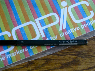
These were the same for both of us.



The papers on the inside are also from the Imagine Nursery Tales cart. The sentiment was done digitally, however the images were stamped. The star, under the word "star", was with Studio g pigment chalk ink and a stamp from Northwoods and the ones on the bottom are with Mementos Angel Pink dye ink and an un-named stamp, that I got from a friend. The fonts are LD farfetched, (from Learning Delights) Wizzard (free on the internet) and Storybook (also free on the internet - try Urban fonts). The blue paper was stamped with a stamp by The Stamping Bug and embossed with Kaleidoscope embossing powder. (The last names have been obscured in iPhoto to protect the innocent - ha, ha!)

What would I have done differently? Well, there is the usual, stamp straighter, on the inside ;- ) Otherwise, I'm pretty happy with the way this one turned out. The Imagine, didn't do a very good job cutting the the stripped part on the front and I could have made it do that again. I had re-calibrated it just the other day, so I don't know what it problem was. Maybe the heat and humidity.
With the Prima flower on the front, I used my Ultimate Crafter's Companion to make and envelobox for the card. That's an envelope that has some depth to it. It still isn't quite deep enough but it's better.


Here are the gifts in the goodie bags that 50 people received at the Splitcoaststampers "Cupcakes and Cocktails" at CHA.

Susan and I both got the same color of Flower Soft, but we got different stamps from Taylored Expressions.

Our stamps were different from Unity Stamps.


These were the same for both of us.

This was also the same.

This was the same.

This was a special stamp from Splitcoast themselves ;- ) Who dusts?
I thought these were wonderful, generous gifts. Thanks so much to the sponsors! The cupcakes were great too. There were door prizes, but we were not the lucky ones. Now I said I'd share our return home story. Since we left from the hotel, instead of the convention center, we entered the parking garage a different way. In the morning we'd taken the pedestrian walkway to the convention center which was on the floor where we parked our car - color green. We got to the elevators, level G color red, get on and there is no color green. I said let's go up 1 floor, because we weren't up very high. We go up and there isn't a green there either. We walk to the edge to look for the walkway and see it below us, huh? Fortunately, I said we should walk down, instead of taking the elevator. There is a floor in-between, where the elevator doesn't go. Then we start to look for our car - D1. we can find Ramp D and Ramp C but no just D. God must have been guiding me, because I get another idea to go up and around and Ramp D is part of the interleave that makes parking garages work, which I've never understood, but knew must be cool. Once on the road we had no more troubles. She and I do go and pick up my son from college with no trouble, handling all of the mess of the downtown Chicago expressways. Somedays you have it and somedays you don't ;- )
Thanks for dropping by a spending some time with me. Please, take a moment more, if you have it and leave a comment, so I have something to read from you. I'd love to know that you were here. Have a blessed Sunday!


